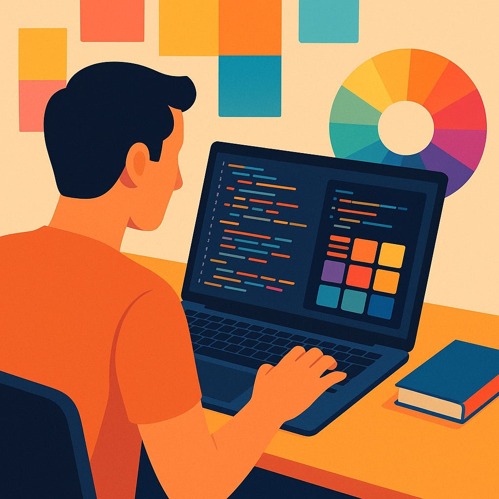
How Color Theory Transforms Your Coding Tools
Boost readability, reduce eye strain, and sharpen focus by applying hue, saturation, and contrast principles to your editor and terminals.
Choosing colors isn’t just for graphic designers or UI specialists. As developers, we spend hours staring at code editors, terminals, and dashboards—environments where good color choices can boost readability, reduce fatigue, and even sharpen focus. In this article, we’ll explore fundamental color-theory concepts and show you how to apply them to your coding tools so that your workflow is as pleasant as it is productive.
1. Why Color Matters in Development
Readability & Contrast
High contrast between text and background increases legibility, especially during long coding sessions or under different lighting conditions.
Poor contrast strains your eyes, leading to headaches and slower debugging.
Syntax Highlighting & Cognitive Load
Differentiating keywords, strings, comments, and operators by color helps your brain parse code structure faster.
Thoughtful palettes reduce “code noise,” so you can scan for errors or patterns at a glance.
Mood & Focus
Warm hues (reds, oranges) can energize you during creative coding or early brainstorming.
Cool hues (blues, greens) promote calm concentration for deep-work sessions, like refactoring or writing tests.
2. Core Color-Theory Principles for Your Editor
Before you tweak your theme, let’s revisit three pillars of color theory:
Hue: the base color (e.g., “blue” or “magenta”).
Saturation: the intensity or purity of that hue.
Value (Lightness): how light or dark it is.
A balanced theme uses a limited set of hues (2–3), adjusts saturation for emphasis, and varies value for clear hierarchy.
3. Building a Developer-Friendly Palette
Step 1: Pick a Base Background
Dark vs. Light: Dark backgrounds are popular for reducing glare in low-light environments, while light backgrounds can feel more natural in daylight.
Tip: Choose a mid-level darkness/lightness (Value ≈ 20–30% for dark, 70–80% for light) to leave room for both brighter and darker accents.
Step 2: Select Your Primary Hue
Neutral Gray: Use for general text and UI chrome.
Accent Hue: One strong hue (e.g., cyan or violet) highlights keywords, function names, and links.
Step 3: Define Secondary Hues
Strings & Literals: A warm hue (orange, gold) contrasts nicely against cool accents.
Comments & Documentation: A desaturated hue—think gray-green—to sit in the background but remain legible when needed.
Step 4: Test Contrast Ratios
WCAG Standard: Aim for at least 4.5:1 contrast for normal text.
Tooling: Use online contrast checkers (e.g., WebAIM’s Contrast Checker) or IDE plugins that warn you in real time.
4. Real-World Examples & Tools
4.1 VS Code Themes
“Night Owl”
Base: Dark navy
Keywords: Electric cyan (Hue shifted ≈ 190°)
Strings: Tangerine orange
Why It Works: High contrast between cyan and navy speeds up scanning, while orange strings “pop” without overwhelming your eyes.
4.2 JetBrains IDEs
“Darcula” (Built-in Dark Theme)
Neutral: Soft charcoal
Keywords: Lavender (120° hue shift)
Comments: Muted gray
Tip: Customize Darcula’s violet accents to a cooler blue if you find purple too warm for extended focus.
4.3 Terminal Color Schemes
Base16 Builder: Generate light or dark terminal schemes from a palette of 16 colors—ideal for matching your code editor.
Oh My Zsh Themes: Many include curated palettes; pick one with clear red/green distinctions to avoid confusing git status indicators.
5. Beyond the Editor: Color in Dashboards & Diagrams
Monitoring Dashboards: Use warm colors (reds/oranges) sparingly for alerts; reserve greens/blues for stable statuses.
Sequence Diagrams & Flowcharts: Assign consistent hues to services or domains—e.g., UI components always blue, data layers always green—to reinforce mental mapping.
6. Accessibility & Color-Blindness
About 8% of men and 0.5% of women have some form of color-vision deficiency. To accommodate everyone:
Avoid Relying Solely on Hue: Pair colors with icons, underlines, or font-style changes.
Use Color-Blind Friendly Palettes: Tools like Coblis let you preview your theme under various types of color blindness.
7. Rapid A/B Testing in Your Workflow
Switch Themes by Task: Try a high-contrast warm theme for quick bug fixes, then swap to a cooler, softer theme for deep work.
Timer-Based Reminders: Every 60 minutes, switch to a light theme for 10 minutes to reset your eyes and avoid strain.
Conclusion
Color theory isn’t a designer’s secret—it’s a developer’s superpower. By applying hue, saturation, and value principles to your coding tools, you’ll write cleaner code, debug faster, and experience fewer headaches. Start with a balanced palette, test contrast rigorously, and don’t be afraid to iterate. After all, when the tools you use reflect thoughtful color choices, every keystroke feels just a little bit smoother.
Ready to see your code in a new light? Try tweaking your theme today—and share your favorite palettes in the comments!


